A Moody, Low-Maintenance Bathroom We’re Kind of Obsessed With
This bathroom wasn't broken… it just wasn't loved.
Everything worked — the layout, the tub, the basics were all there. But it had that "builder-grade and forgotten" feel. Nothing ugly, nothing exciting either.
The homeowner didn't need a gut job. They just wanted it to feel:
- cleaner
- easier to keep up with
- and actually enjoyable to walk into every morning
That's our favorite kind of project.
📸 Before: Functional but Flat
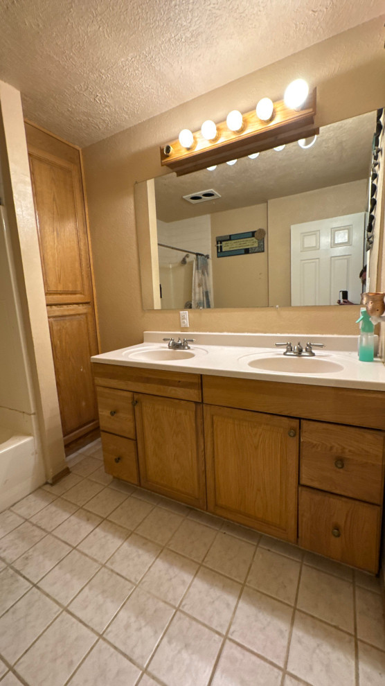
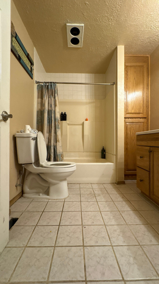
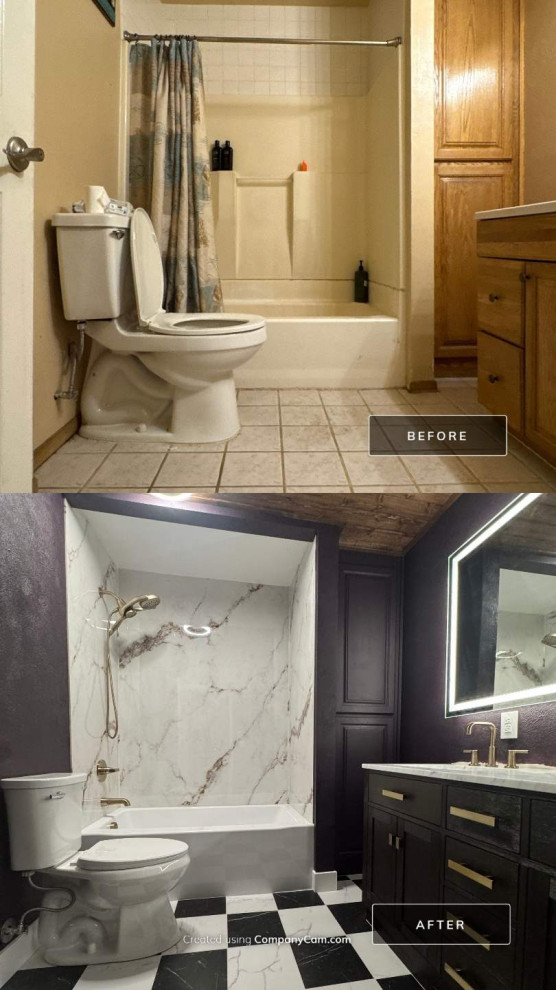
This hallway bathroom had all the right fundamentals—great layout, double sinks, and solid storage—but visually, it felt dated and uninspired.
Warm oak cabinetry, beige tile, and oversized lighting created a space that lacked contrast, depth, and personality. Everything blended together, leaving the room feeling flat rather than thoughtfully designed.
Key Challenges
- Overly warm tones throughout the space
- Builder-grade finishes lacking character
- Heavy visual feel from tile and cabinetry
- Outdated lighting and mirror setup
- No focal point or design direction
🧠 The Plan
The Design Direction: Rich, Moody, and Timeless
Instead of going light and airy, this design takes a bold, elevated turn.
Drawing from the concept: A rich, earthy palette anchored by a deep black-violet wall color, layered with warm wood, brass accents, and textured finishes.
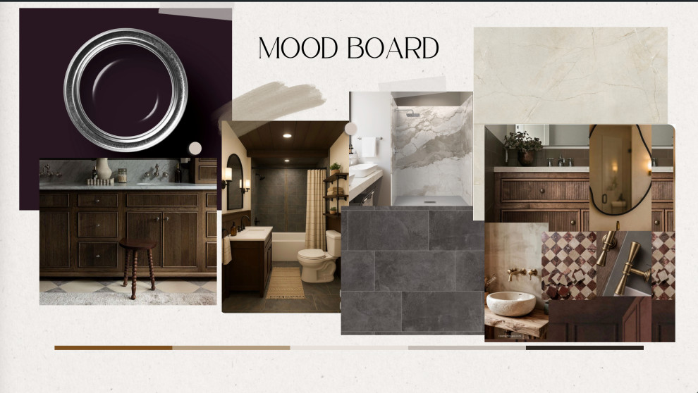
This approach transforms the bathroom from basic → boutique.
The Vision
- Moody walls for depth and drama
- Warm wood tones to ground the space
- Brass fixtures for a hint of vintage charm
- Textured tile + stone-inspired surfaces for visual interest
- Layered lighting to create warmth and ambiance
🔨 The Process
Built to Last
We took this one all the way back to the studs—which is always equal parts exciting and slightly terrifying.But this is where good bathrooms are made.
Before anything pretty goes in, we focus on:
- Structure
- Plumbing
- Waterproofing
- Getting everything level (especially the tub… non-negotiable)
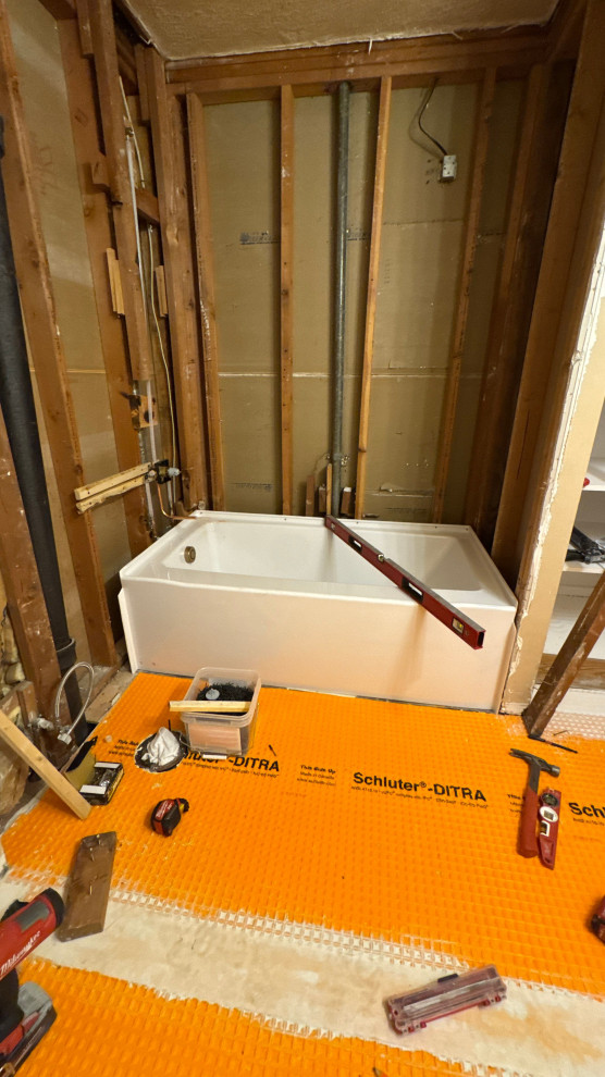
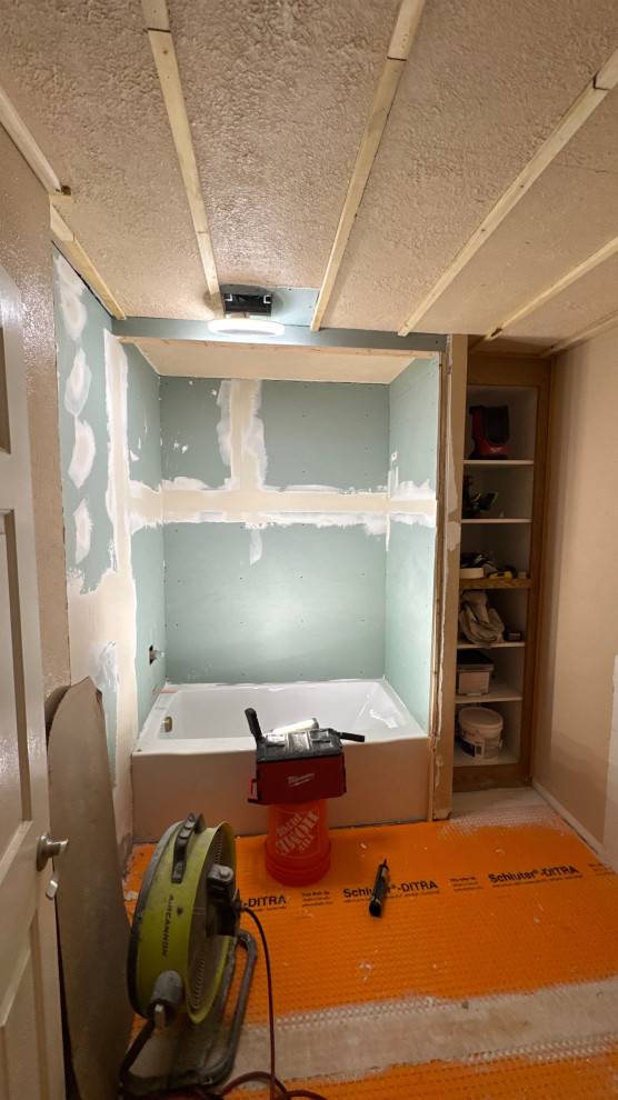
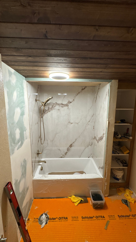
We took this one all the way back to the studs—which is always equal parts exciting and slightly terrifying.
But this is where good bathrooms are made.
Before anything pretty goes in, we focus on:
- structure
- plumbing
- waterproofing
- getting everything level (especially the tub… non-negotiable)
We installed Schluter-DITRA uncoupling membrane across the bathroom floor, and rebuilt the tub surround properly with moisture-resistant drywall before a single panel went up so this bathroom isn’t just a quick facelift—it’s something that’s going to last.
We also handled new ceiling framing to prep for the wood plank ceiling overhead.
Every step was done in the right order, with the right materials — because what's behind the walls matters just as much as what you see in front of them.
Because here’s the truth:
👉 Most bathroom failures don’t come from what you see—they come from what’s behind the walls.
✨ The Reveal (and My Favorite Details)
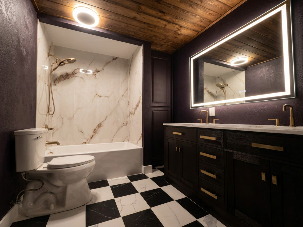
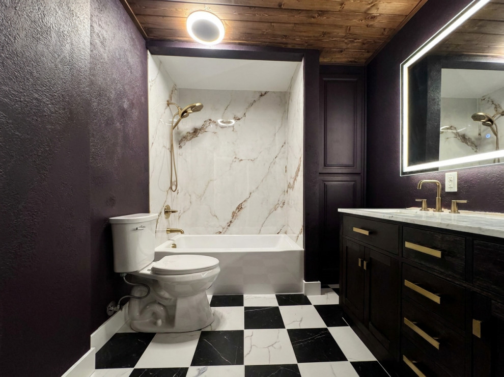
The final result is a space that feels completely refreshed—moody, cozy, and built for everyday use.
Key Features:
- Easy-to-clean wall system
- Updated fixtures
- Seamless, watertight install
- Fresh, modern feel
This project is a great example of how you don’t need a full custom remodel to completely transform your bathroom. Smart material choices can go a long way.
Let's start with the shower because it's probably the first thing people notice.
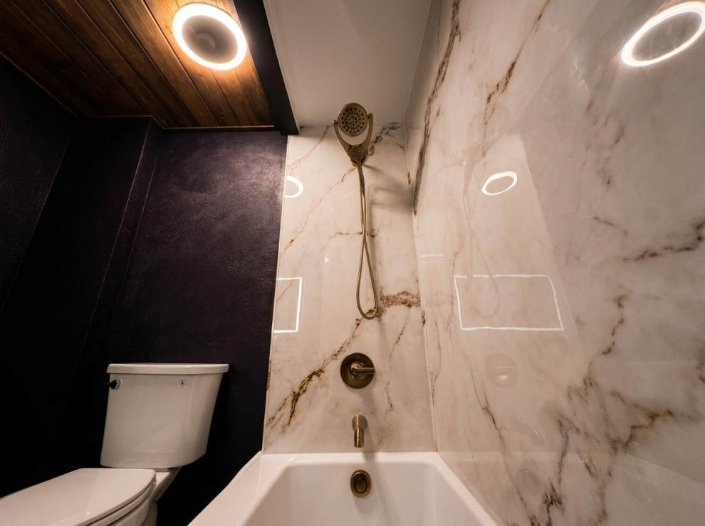
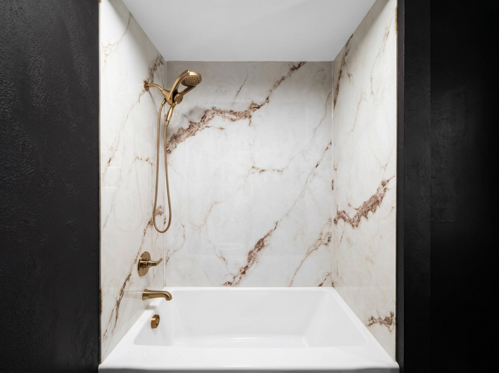
At first glance, most people assume the walls are large marble slabs. They're actually Polymarm Calacatta Mocha polymer panels, and honestly, I think they're one of the most underrated products in bathroom remodeling. They have the look of marble without all the grout lines, which means they're incredibly easy to keep clean. For this family, that was a huge win. They wanted something beautiful, but they also wanted a bathroom that wouldn't feel like another chore to maintain.
The Delta Sparrow shower system in Champagne Bronze was one of those details that quietly pulled everything together. The warm finish plays so well with the wood ceiling and the cabinet hardware, and having the handheld spray is one of those little upgrades you don't realize you'll appreciate until you use it every day.
And then there's the paint.
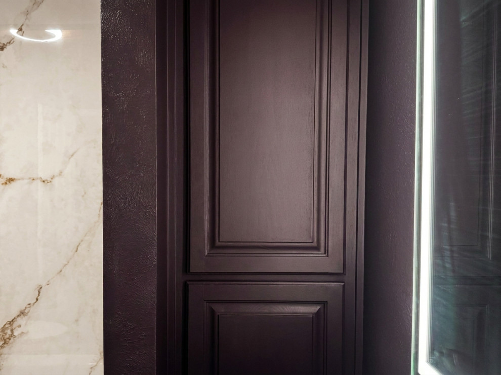
I'll admit, choosing such a dark color for a bathroom can feel a little bold. But the homeowners never wanted the typical bright white spa aesthetic—they were after something moodier, richer, and a little unexpected. High at the Gala by Tonester Paints became the foundation for the entire design. In some light it reads almost black, while in others you catch these beautiful deep plum undertones. It's dramatic without feeling overwhelming, and I honestly can't imagine this room in any other color now.
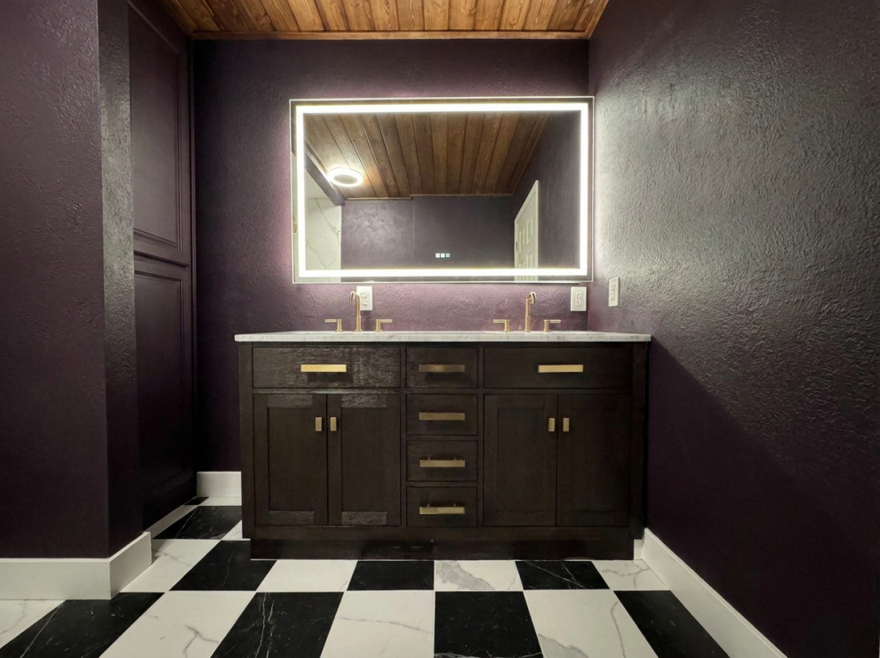
The vanity was one of the pieces the homeowners selected. They had narrowed it down to a few options from Home Depot, and we used AI renderings to help them visualize how each one would look in the space before making the final decision. They landed on this beautiful brown oak double-sink vanity with a Carrara marble countertop, and it couldn't have worked out better. The warm wood keeps the room from feeling too dark, while the marble brightens the entire vanity wall. Paired with the Delta Nicolai faucet in Champagne Bronze, it feels warm, timeless, and perfectly balanced. They loved it so much they decided to use the same vanity in their primary bathroom too, creating a subtle sense of continuity between the two spaces.
Can we also talk about the mirror for a second? We went with an oversized 60-inch LED mirror, and I think it was absolutely the right call. It makes the whole vanity wall feel more custom, throws beautiful even light across the room, and the built-in anti-fog feature is one of those little luxuries that quickly becomes something you never want to live without.
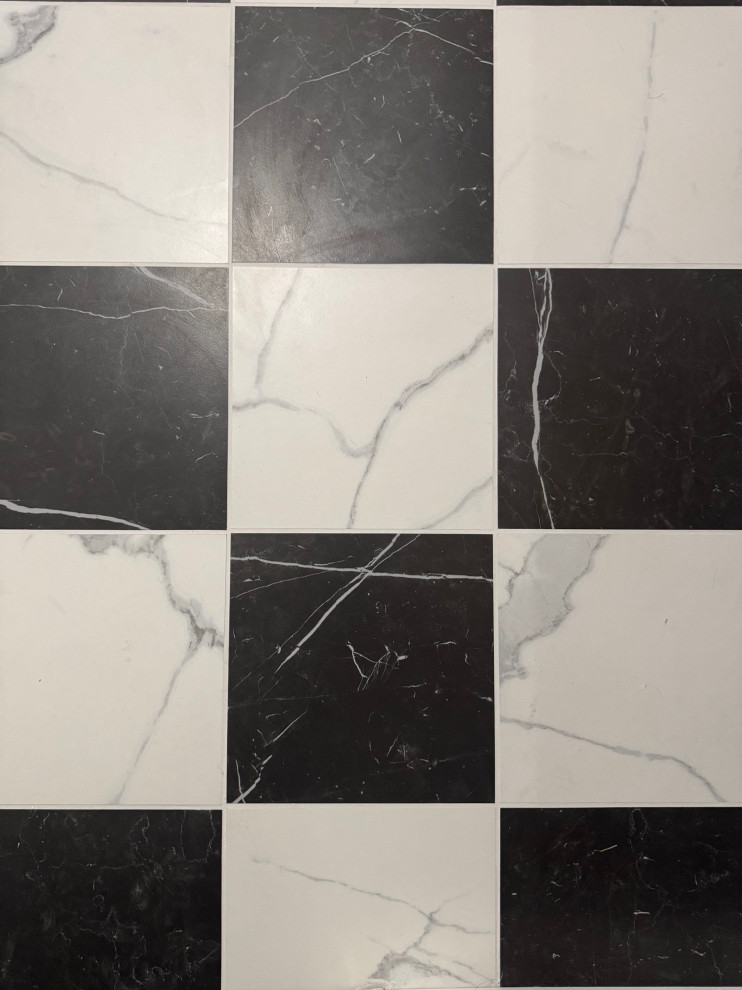
And then there's the floor.
I actually stumbled across this checkerboard marble-look tile while browsing the Edward Martin website, and I couldn't stop thinking about it. It felt bold, timeless, and just a little unexpected. I shared it with the homeowners, and we all agreed it was worth taking the risk. Looking at the finished room now, I think it might be my favorite design decision. It grounds the space, adds personality, and gives the bathroom that memorable detail that makes you stop for a second look.
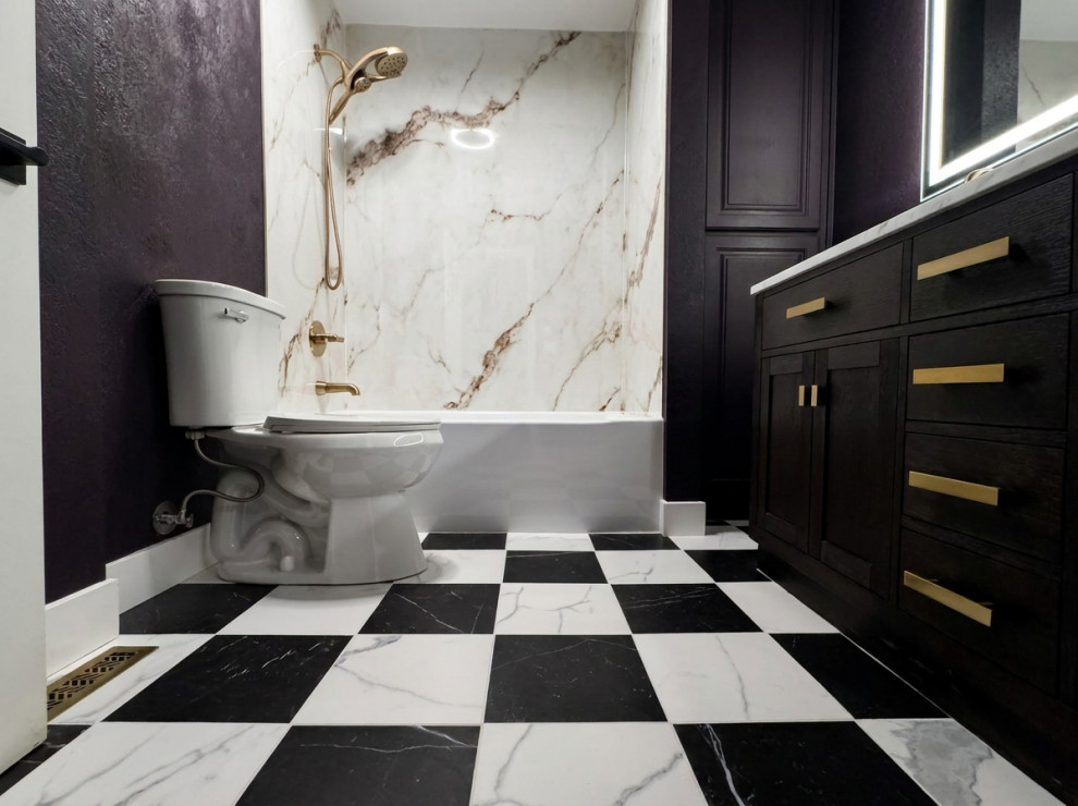
The difference from before to after is almost hard to believe. What was once a flat, forgettable space is now the kind of bathroom that makes people stop and say "wow."
The Takeaway
Smart material choices — polymer panels, a bold paint color, quality fixtures with a cohesive finish — can deliver a boutique look without the cost of a full custom tile installation. Smart planning and quality craftsmanship do the rest.
Looking back at the before photos, it's honestly hard to believe this is the same room. That's one of the things I love most about remodeling. Sometimes the biggest transformations don't come from changing the layout—they come from having a clear vision and committing to it from start to finish.
If your bathroom feels stuck in a decade you'd rather forget, we'd love to talk about what's possible. Reach out to the Blue Collar Family Construction team and let's walk through it together.
Shop This Bathroom
If you're anything like me, you've probably been wondering where everything came from.
Here's a complete list of the products we used (or the closest alternatives) if you'd like to recreate this look in your own home.
Paint: High at the Gala – Tonester Paints
Shower Wall Panels: Polymarm Calacatta Mocha
Shower System: Delta Sparrow – Champagne Bronze
Sink Faucet: Delta Nicolai – Champagne Bronze
Vanity: Brown Oak Double Vanity with Carrara Marble Top
Mirror: Toolkiss 60" LED Anti-Fog Mirror
Flooring: Edward Martin Leona Tile